This wordmark is designed with sharp points intruding and extruding from the letterform. These harsh shapes reflect the agitated “again” I felt at the start of this semester. The mark is situated against a backdrop of shattered glass to compliment both the form and concept.
Wordmark Design: AGAIN
You may also like
2017
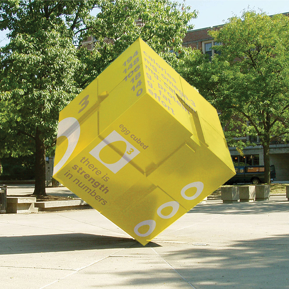
Packaging + Branding Concept: Egg Cubed
2018
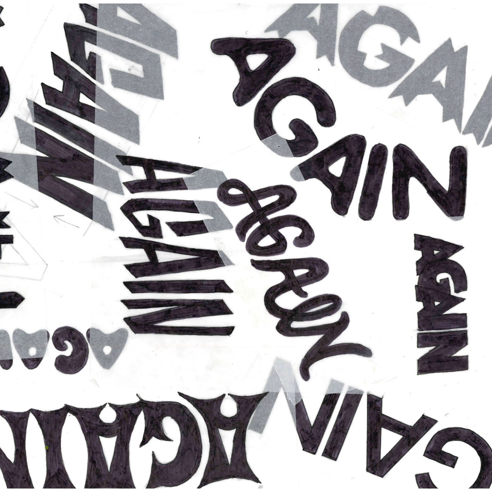
Process Book: Fall 2017

2018
Print Design: Microorganism Pattern Planner
2018
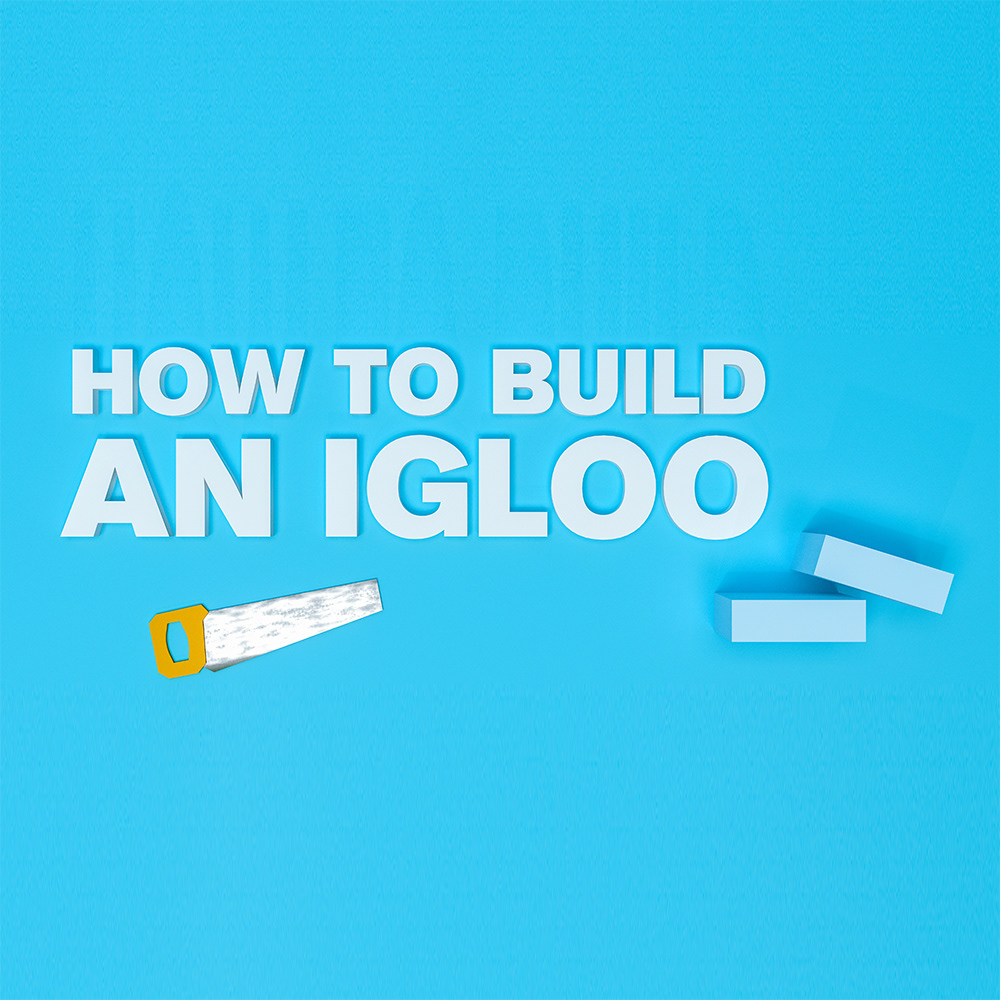
Information Design: How to Build an Igloo
2018
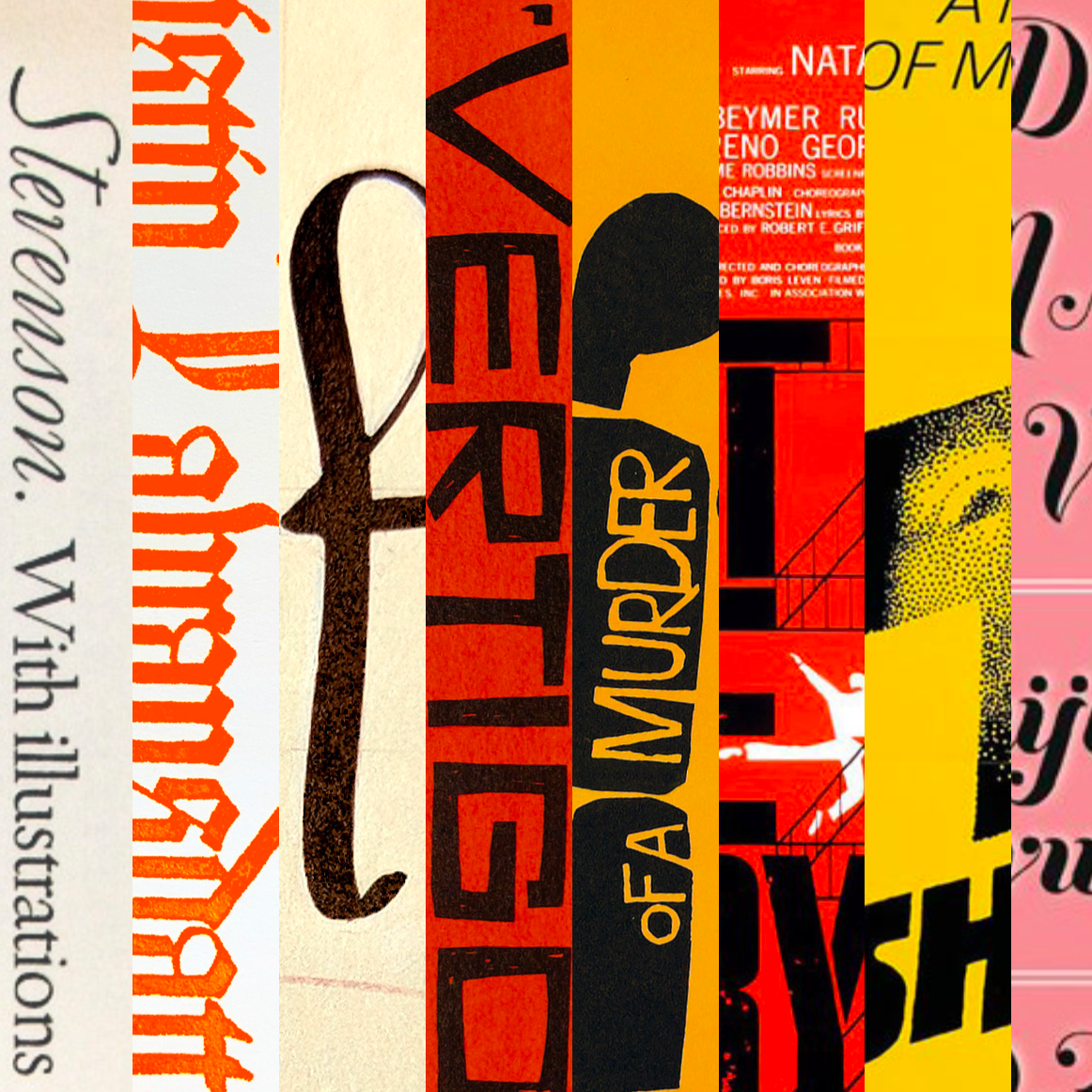
Interactive Evolution of Handlettering
2018
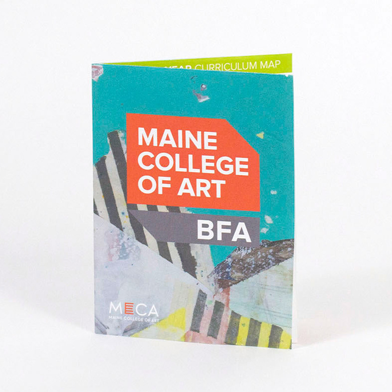
Print Design: Maine College of Art BFA Foldout
2018
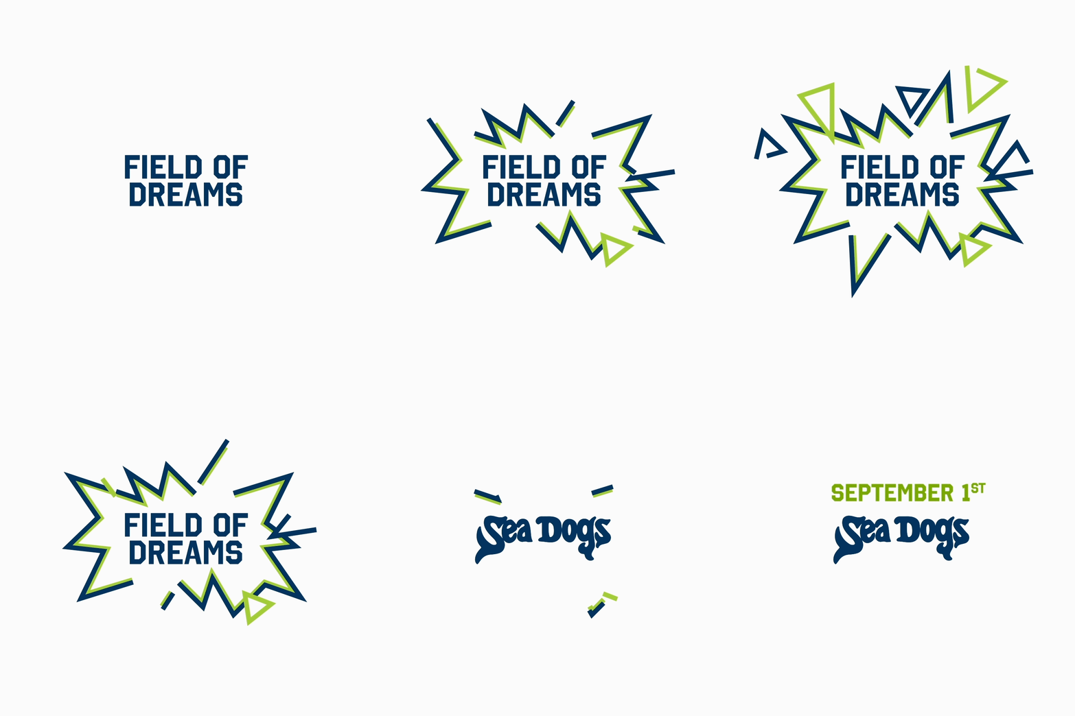
Identity Design: Sea Dogs Field of Dreams
2018
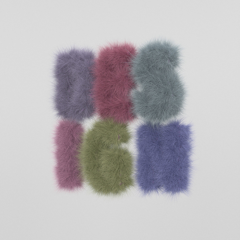
Motion Graphics: Logo Animation
2018
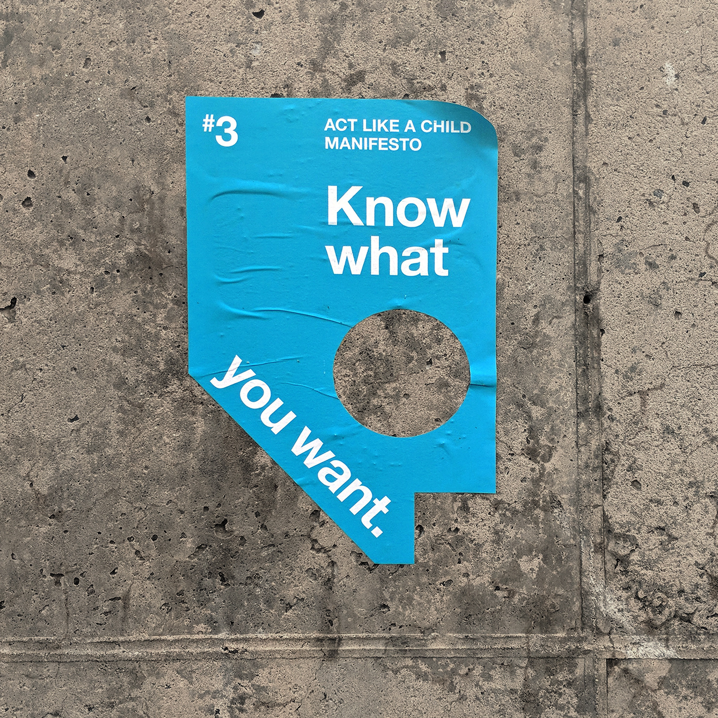
Campaign Design: Act Like a Child Manifesto
2018
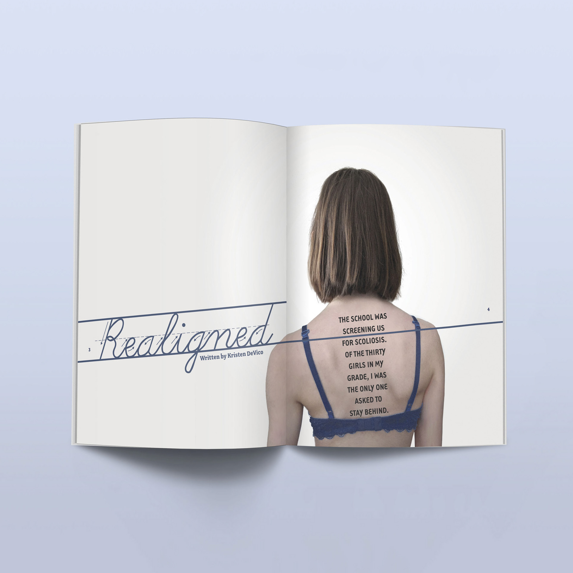
Editorial Design: Realigned
